PORTFOLIO - O Regresso do Jornalismo International Conference

The Return of Journalism
The Return of Journalism
The website
As students at Escola Superior de Comunicação Social, we were
challenged to design and build a very important website for our
college. Me and seven other fellows accepted it. It was a great
pleasure to work with these people.
'O Regresso do Jornalismo' was an international conference belonging
to a circle of academic conferences debating the state of
communication in this digital era.
It did host some of the international and portuguese leading figures
of this vanguard.
This was like 'Mission Critical', we were asked to develop from
scratch, a website for an international conference about
communication, to communicate with communication experts from around
the world.
Could the stakes get any higher?
Yes they could, these guys were there to debate about the journalism
and the pros and cons of the web.
I think everybody liked the outcome, and I had a real good time
doing it.
The website looks
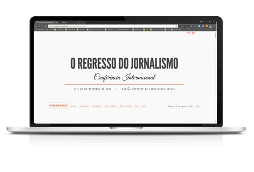
The idea was to have a simple one page layout. It should
'simulate' the look of a newspaper, but at the same time,
add something relevant and new.
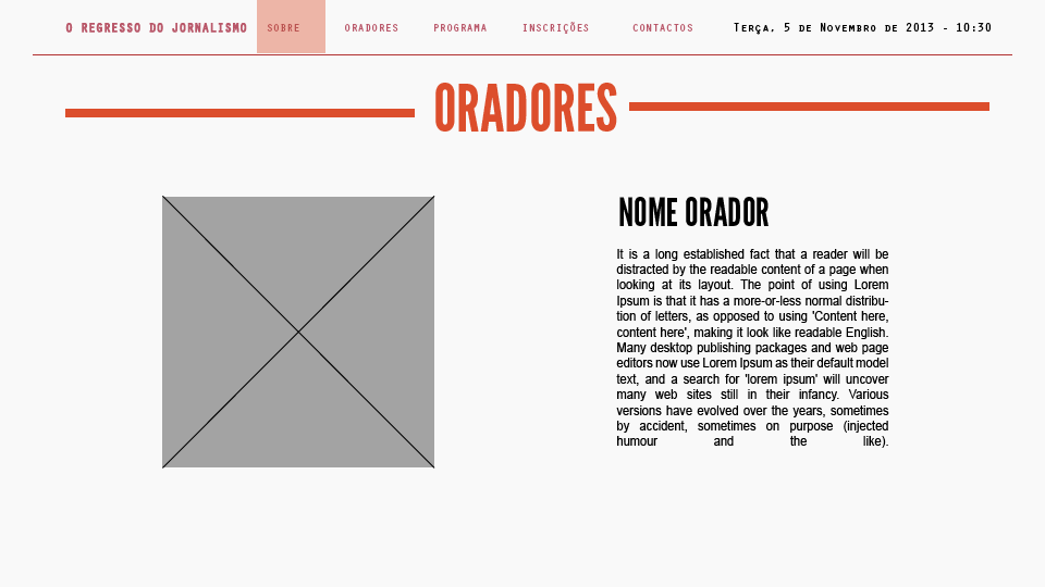
The graphic designers did a spectacular job, drawing all the
speakers faces, mixing cartoon with realism. They created a
logo full of symbolism as well.
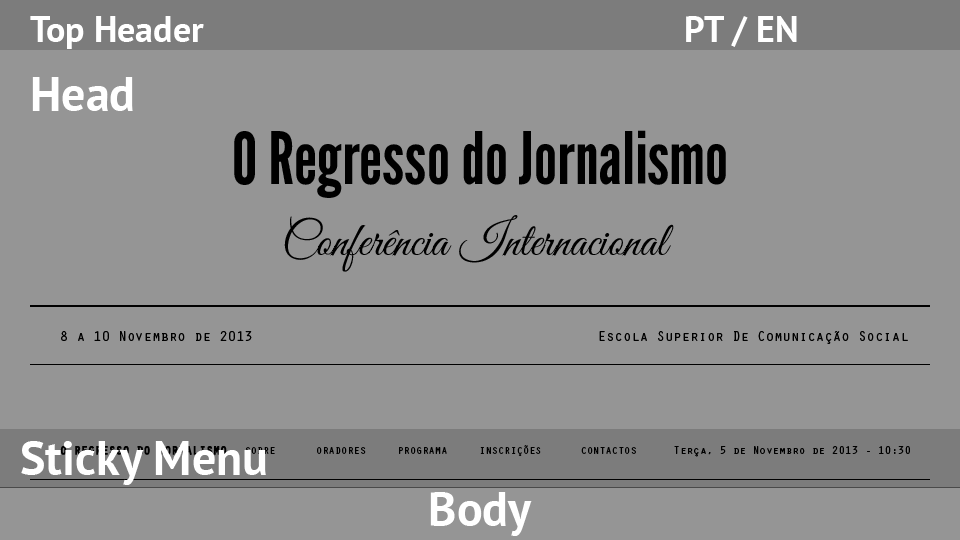
The website main body would briefly present speakers
biography followed by the conference program.
We thought it would be interesting to create an analog way
of showing the program scheddule with some interaction from
the user.
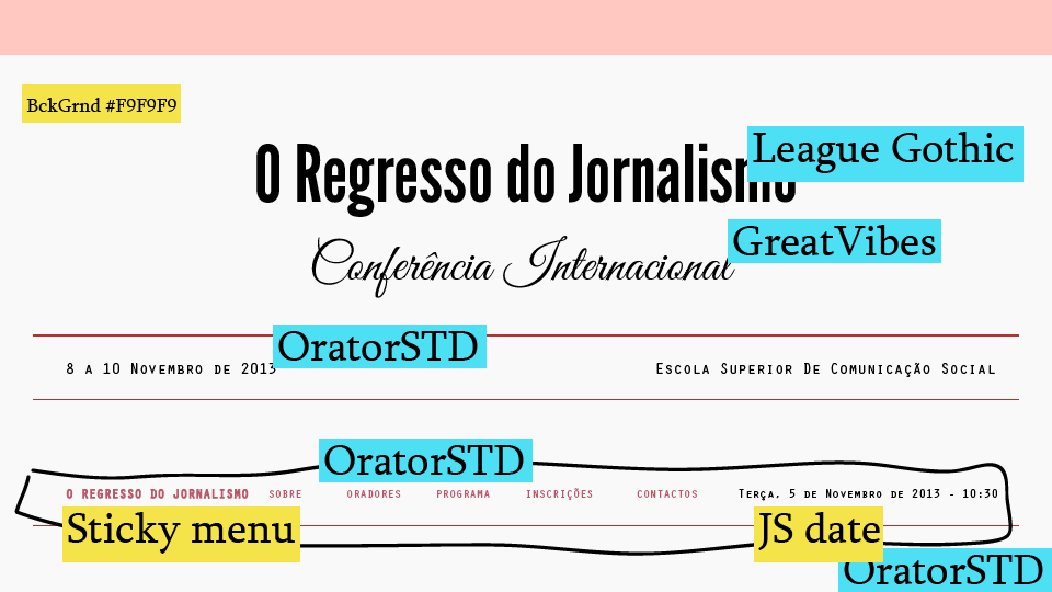
We had a great trouble finding suitable fonts and figuring out what colors to use. In order to keep an appearance that would remember a newspaper, we used colors mostly seen on daily newspapers.

#f9f9f9

#df4d34

#8a8b8f

#424040

#000000
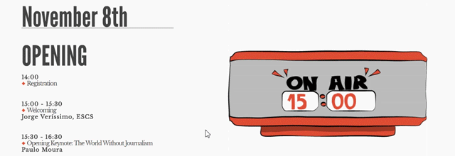
We added an 'analog' scheddule in the program, that would
work with user interaction resembling paper-cut art.

Some guests had their picture drawn by the graphic designer Lourenço Santos. Those drawings looked really cool, and they brought a life into this website.
the home screen
As with the newspapers, the design was based on the
fonts.
We thought we should not use a 'Blackletter' font.
We used 'League Gothic' for headings and
'GreatVibes-Regular', a beautifull font from 'typeSETit'.
And free (worth mention).
Escola Superior de Comunicação Social
Website concept, design and development